Night Club Visual Identity
2025
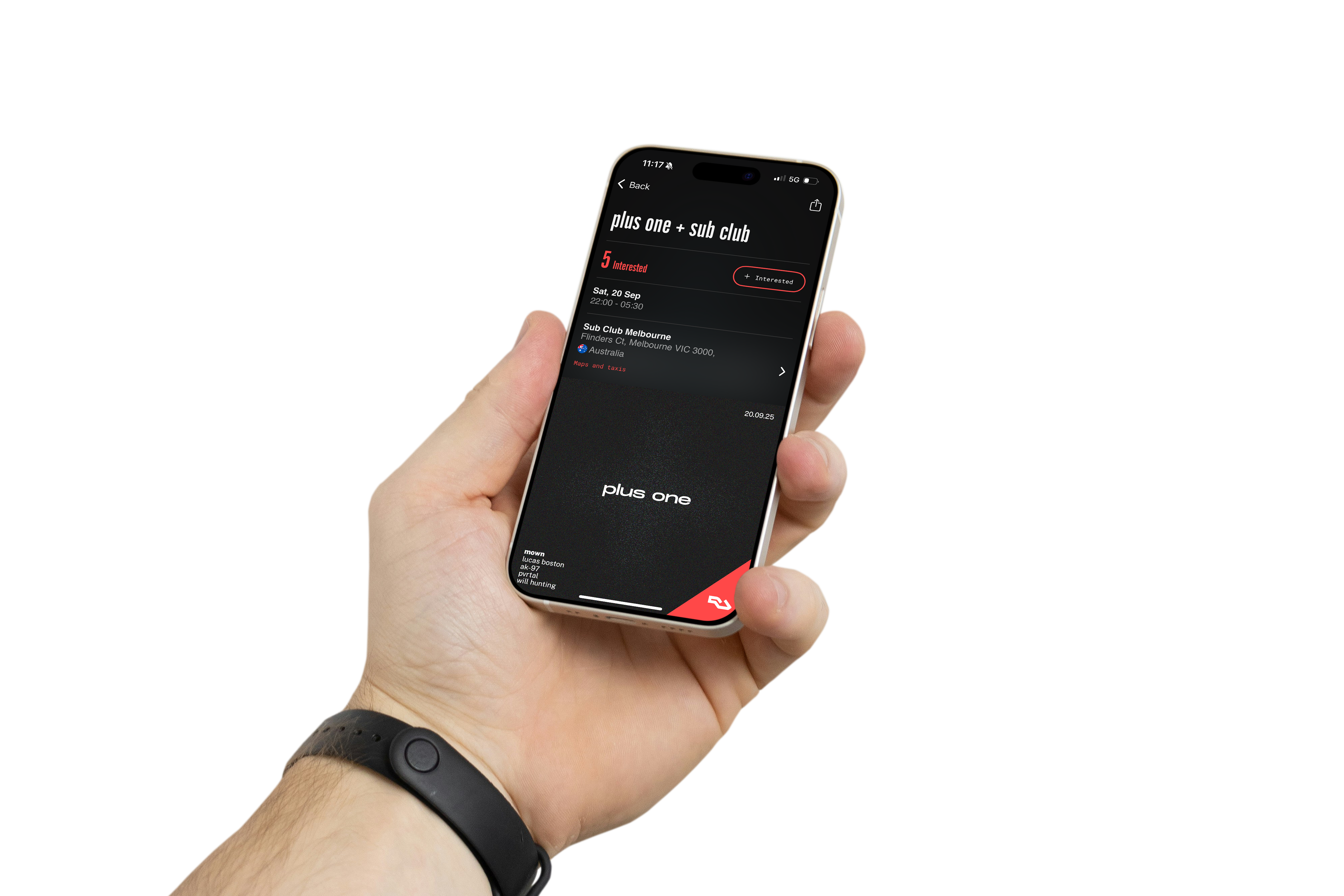
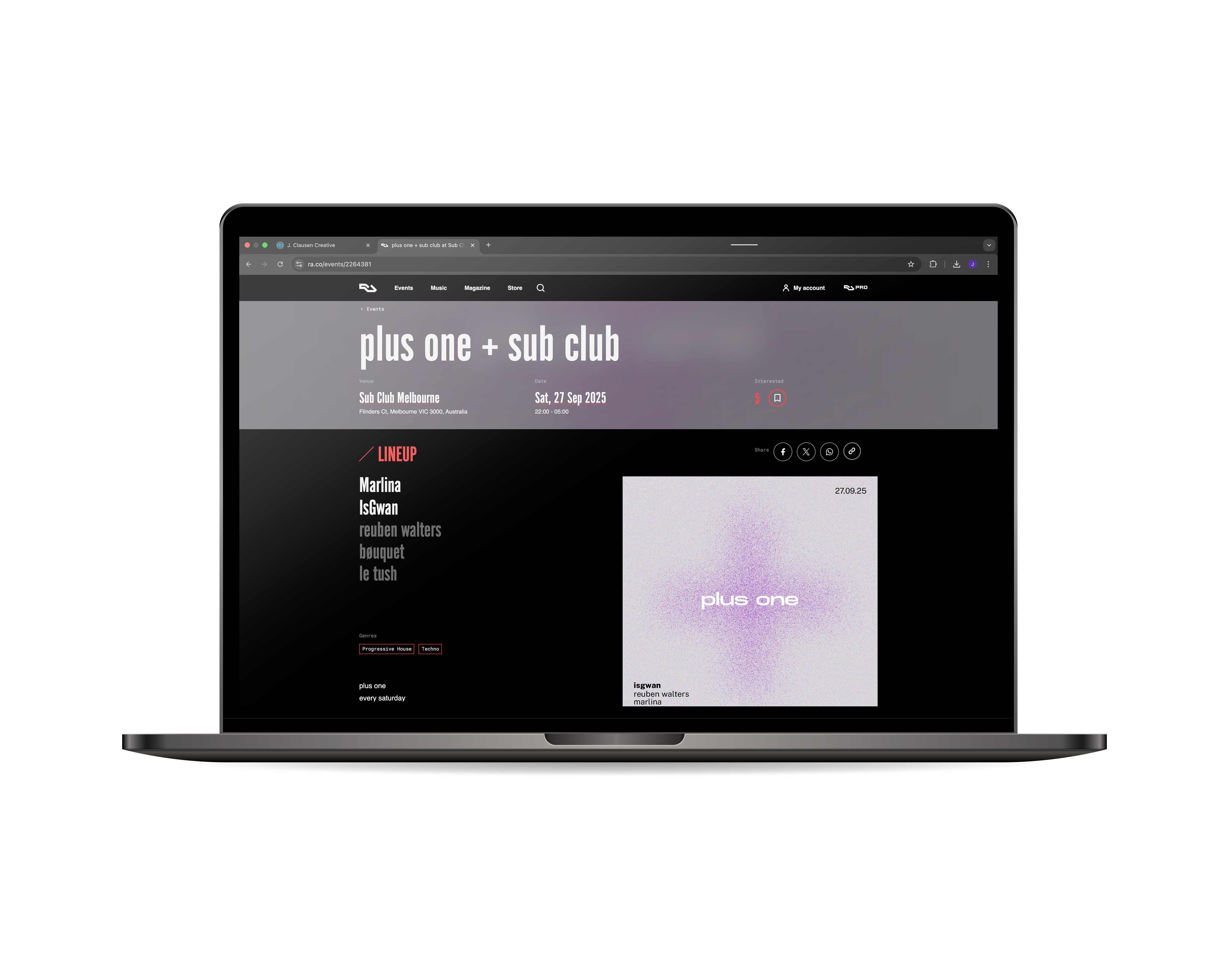
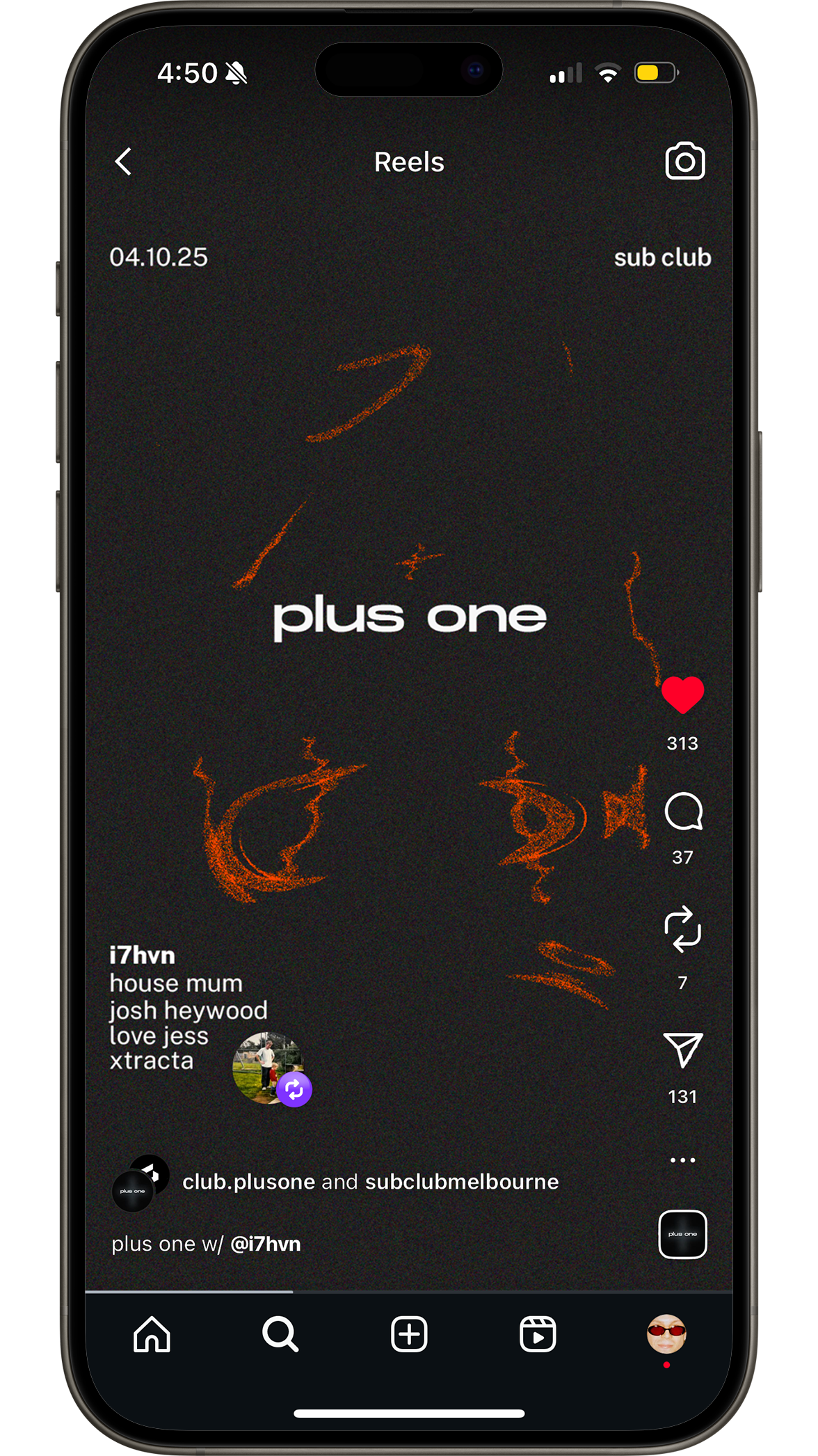
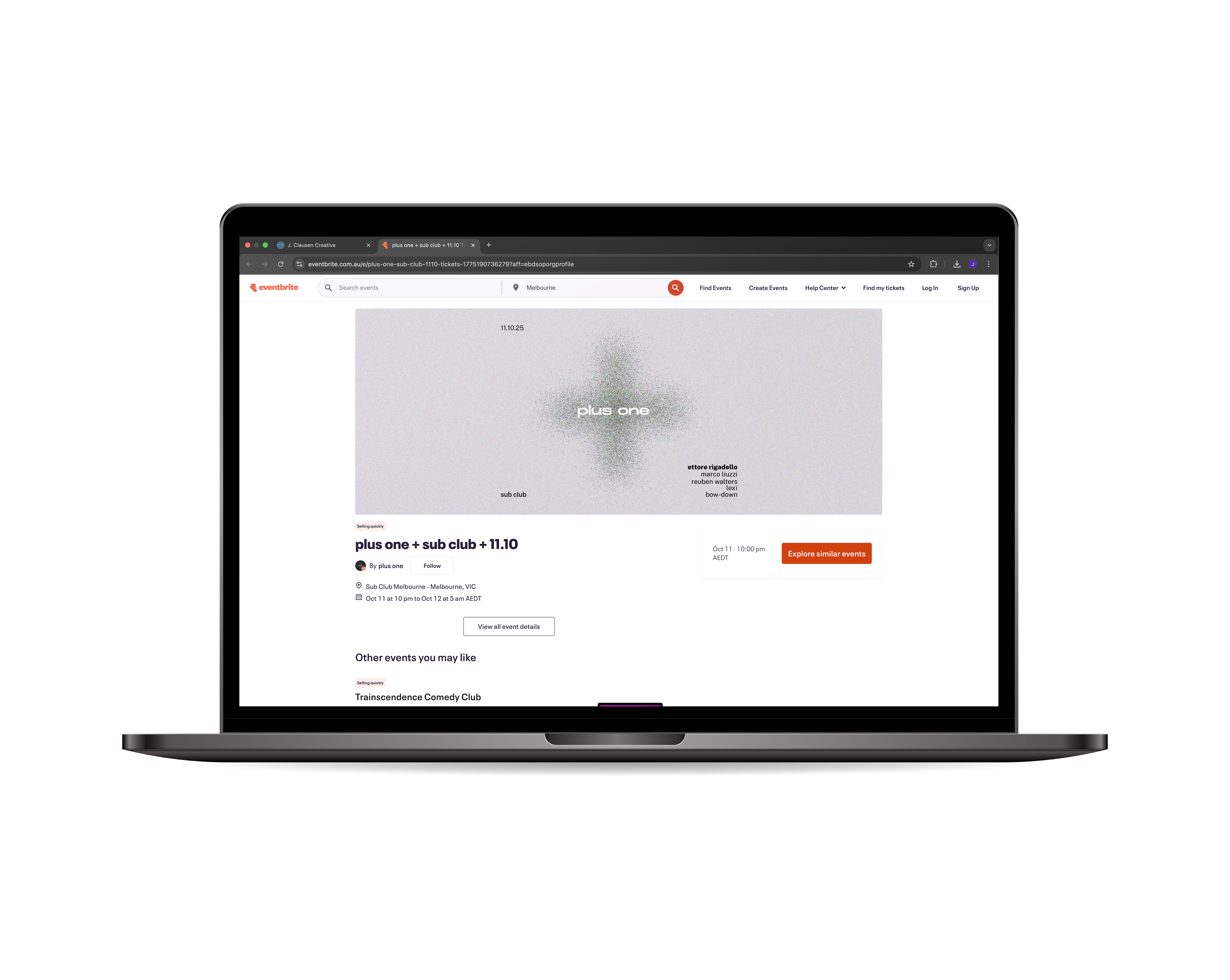
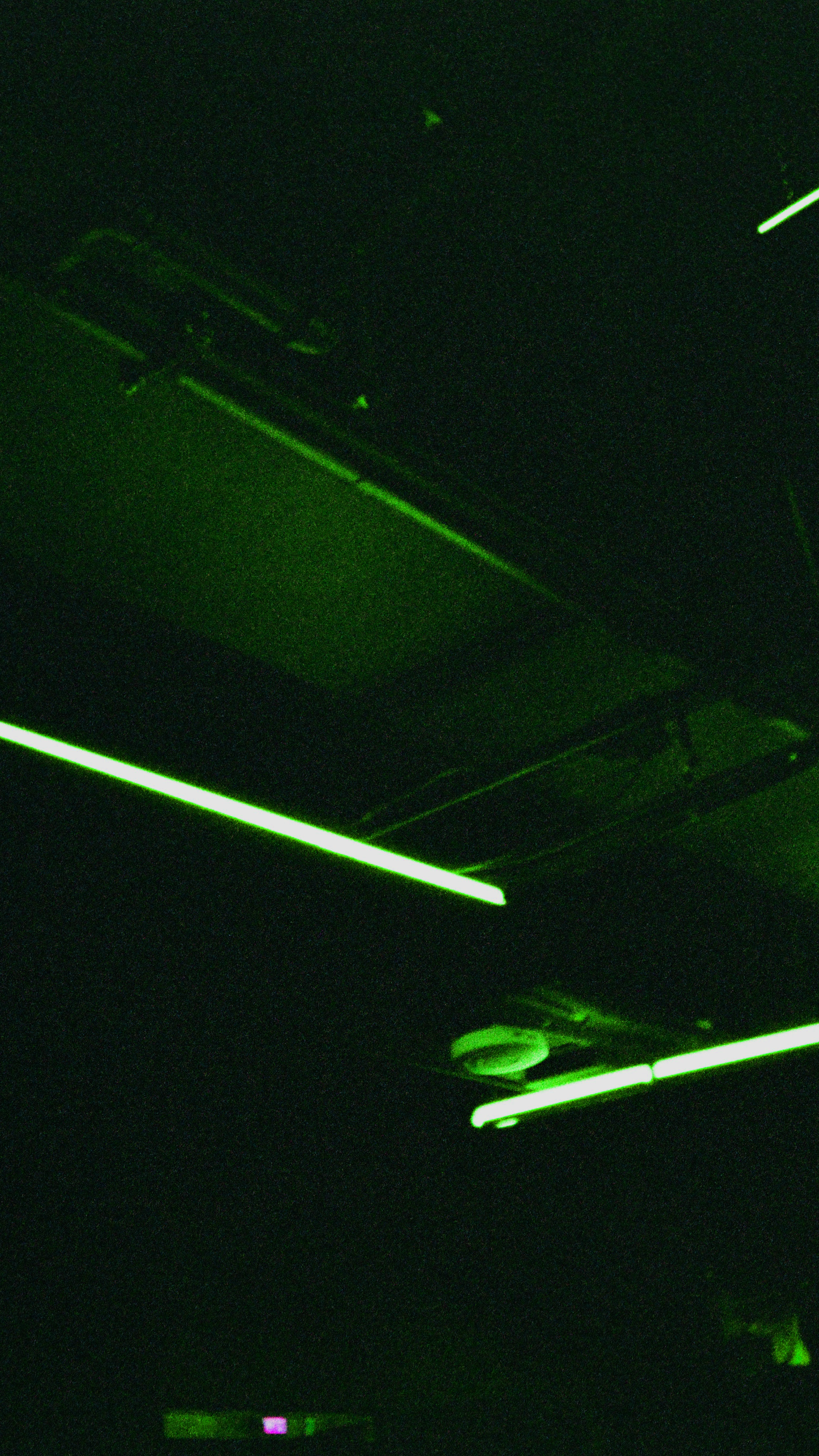
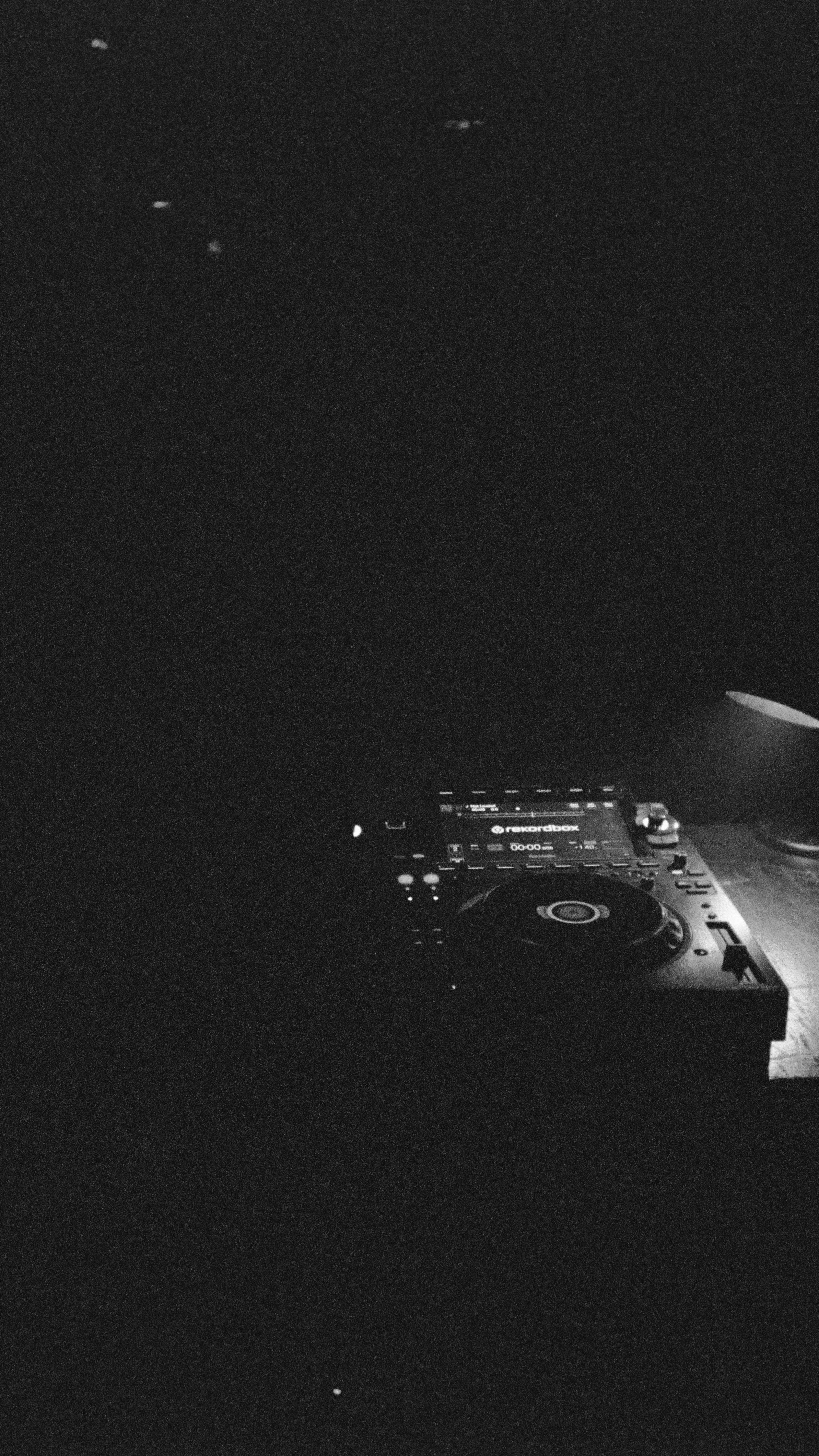
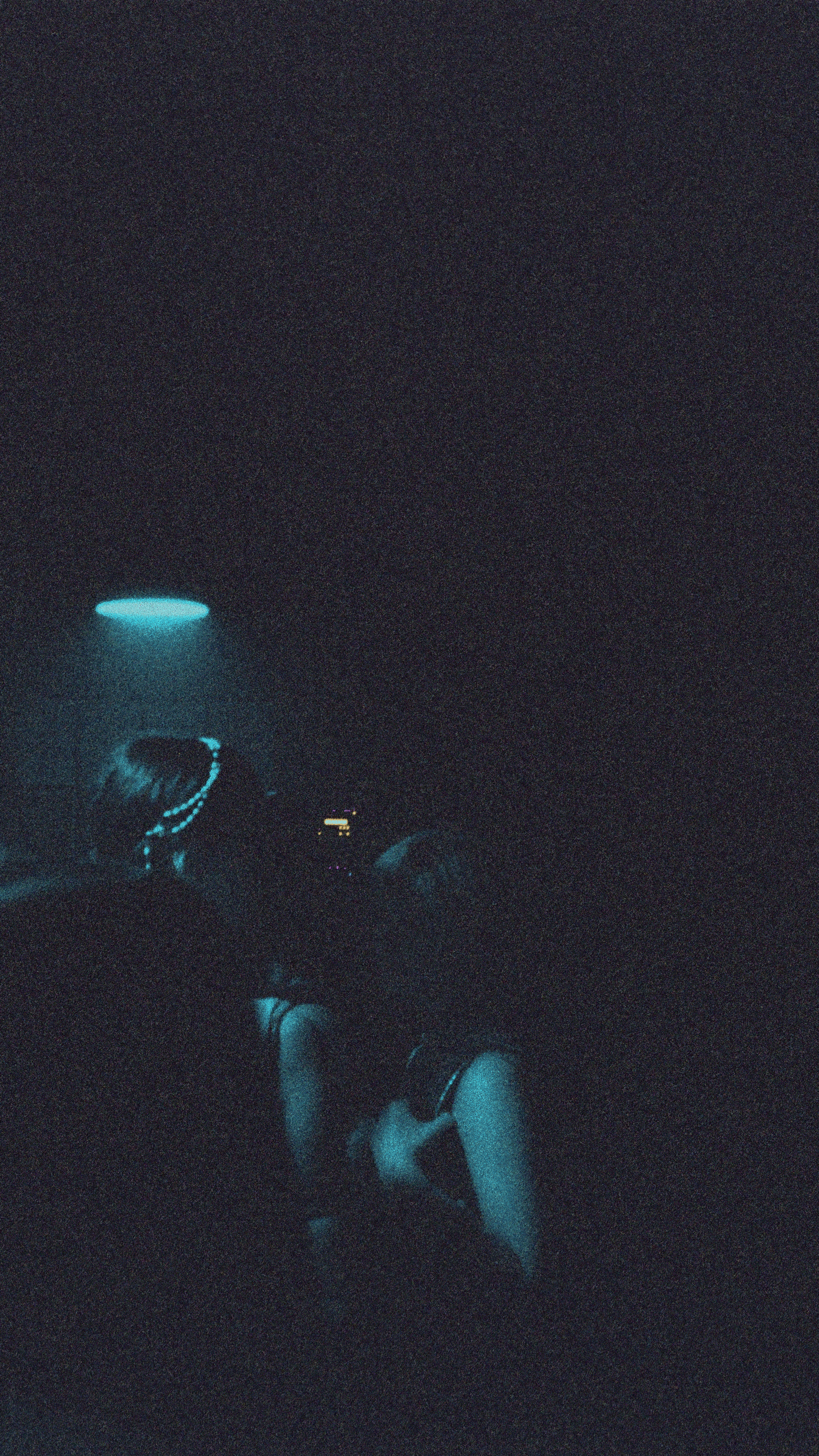
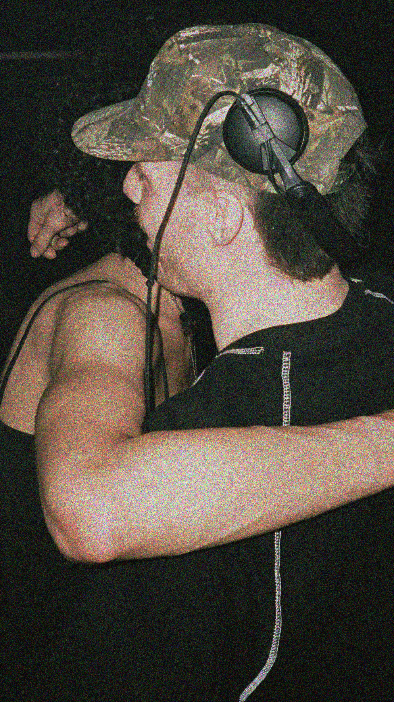
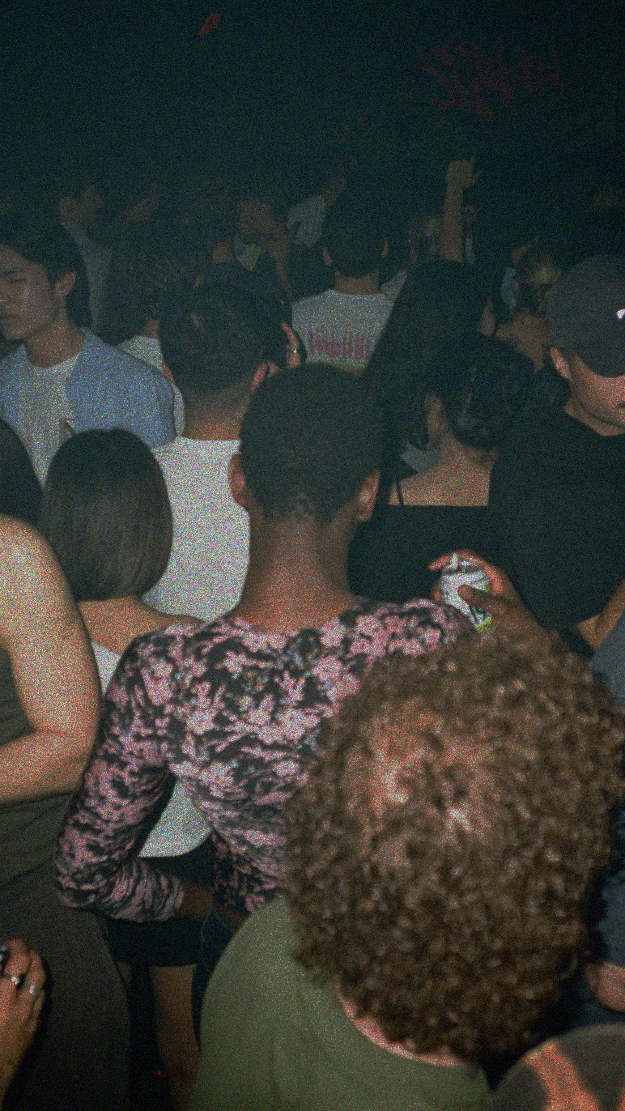
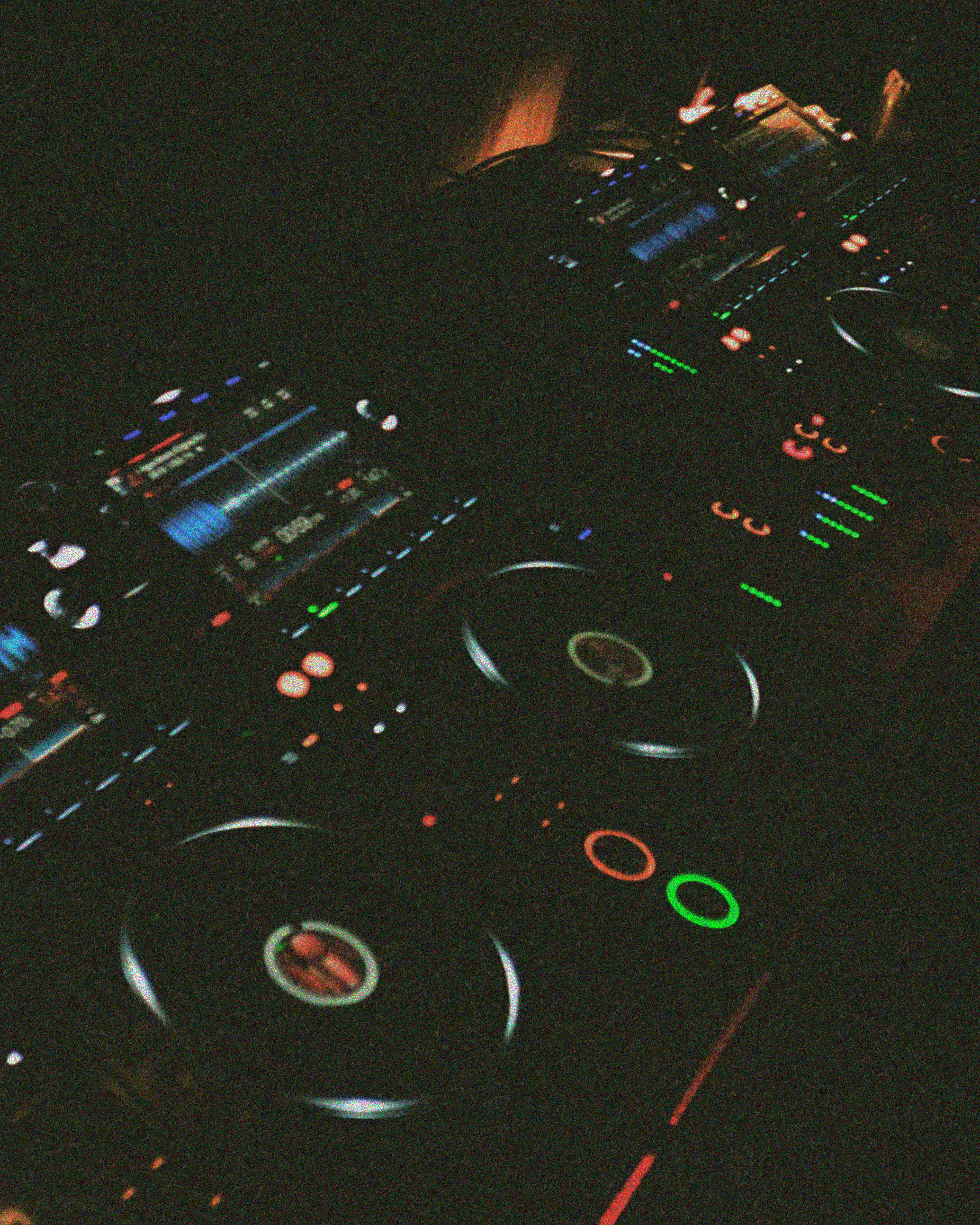
plus one is a weekly club night built around a simple idea; bring someone with you. The name itself is an invitation. It’s about inclusivity, not exclusivity, so the visual identity doesn’t try to fit into a niche aesthetic. It sits somewhere more neutral, aiming to feel familiar to anyone, while still carrying enough attitude to hold its own in a serious club space.
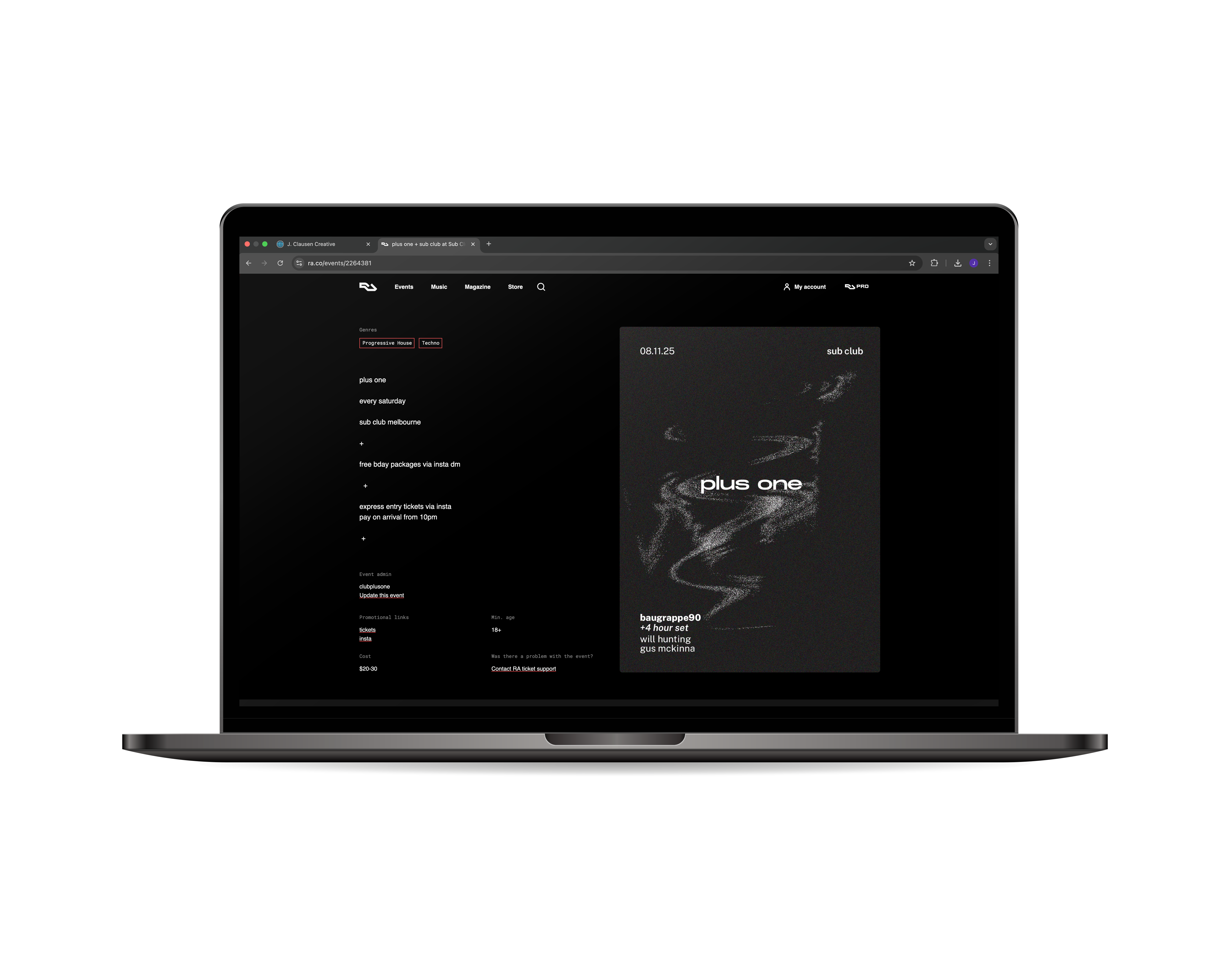
My role covered the full visual direction of the project. I worked closely with the client to build the identity from scratch. Colour, typography, layout and motion design included. The brief asked for no hard edges, no defined shapes, medium to low contrast. The brand name needed to sit front and centre and the main focus was on subtlety, space and confidence.
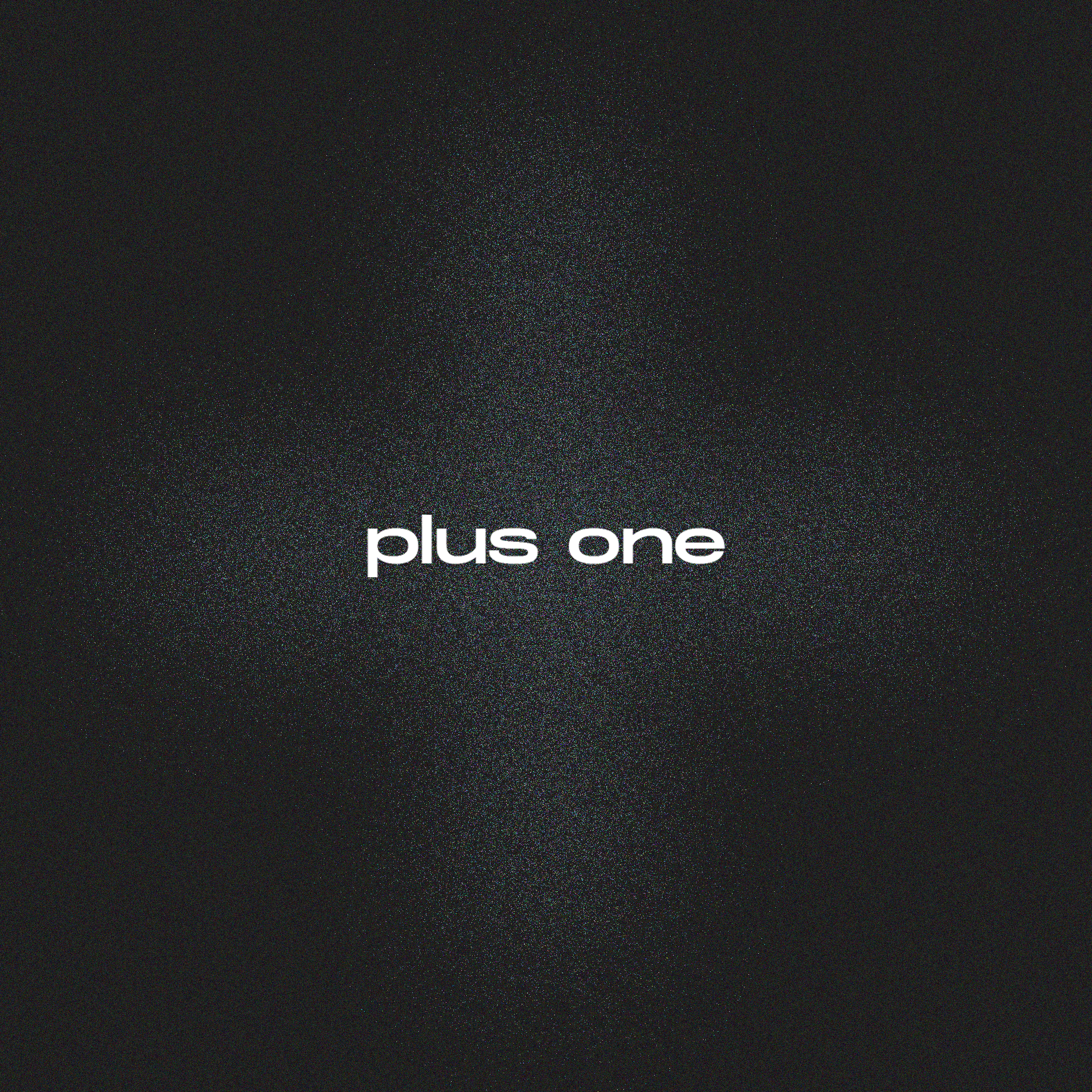
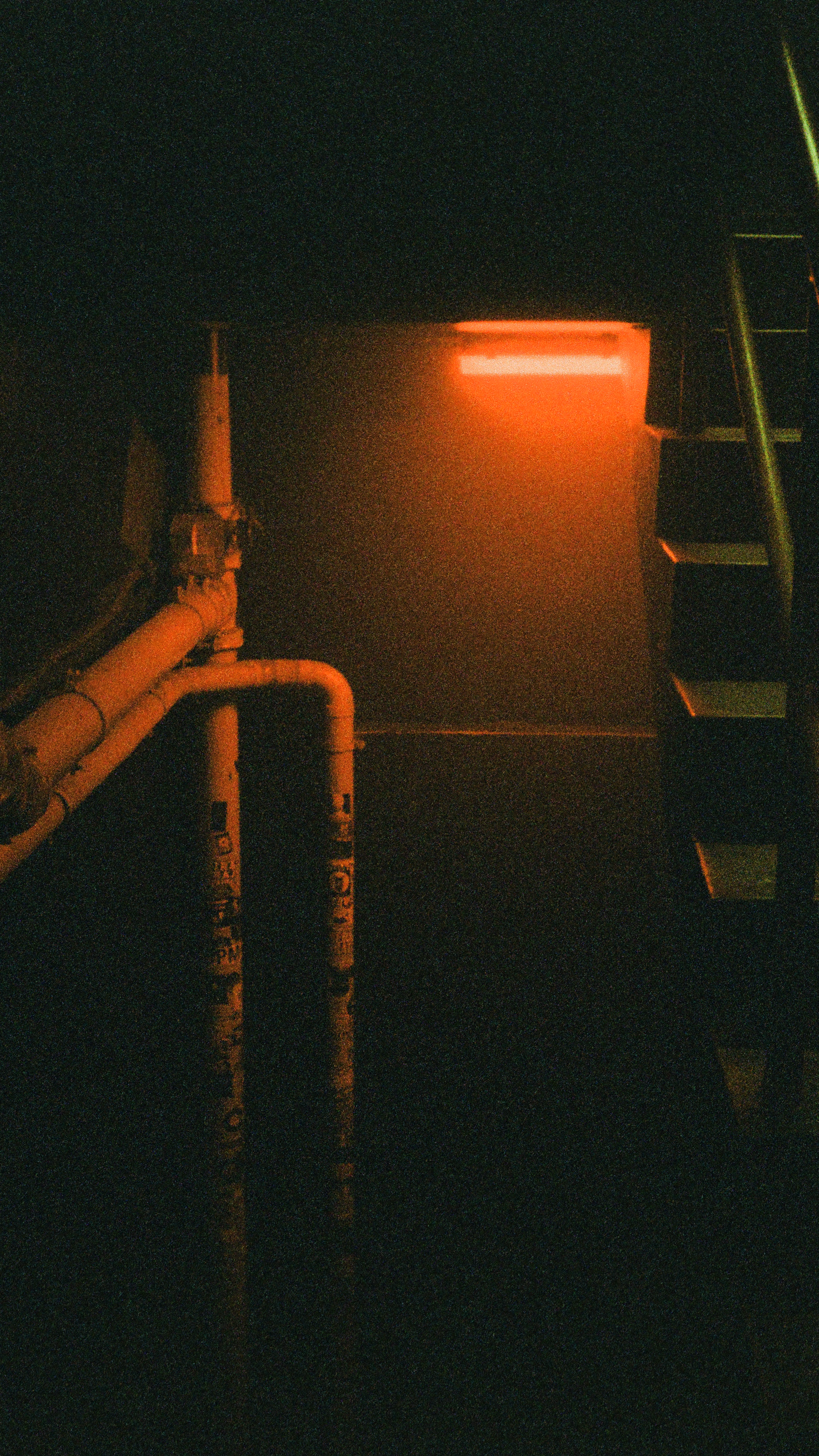
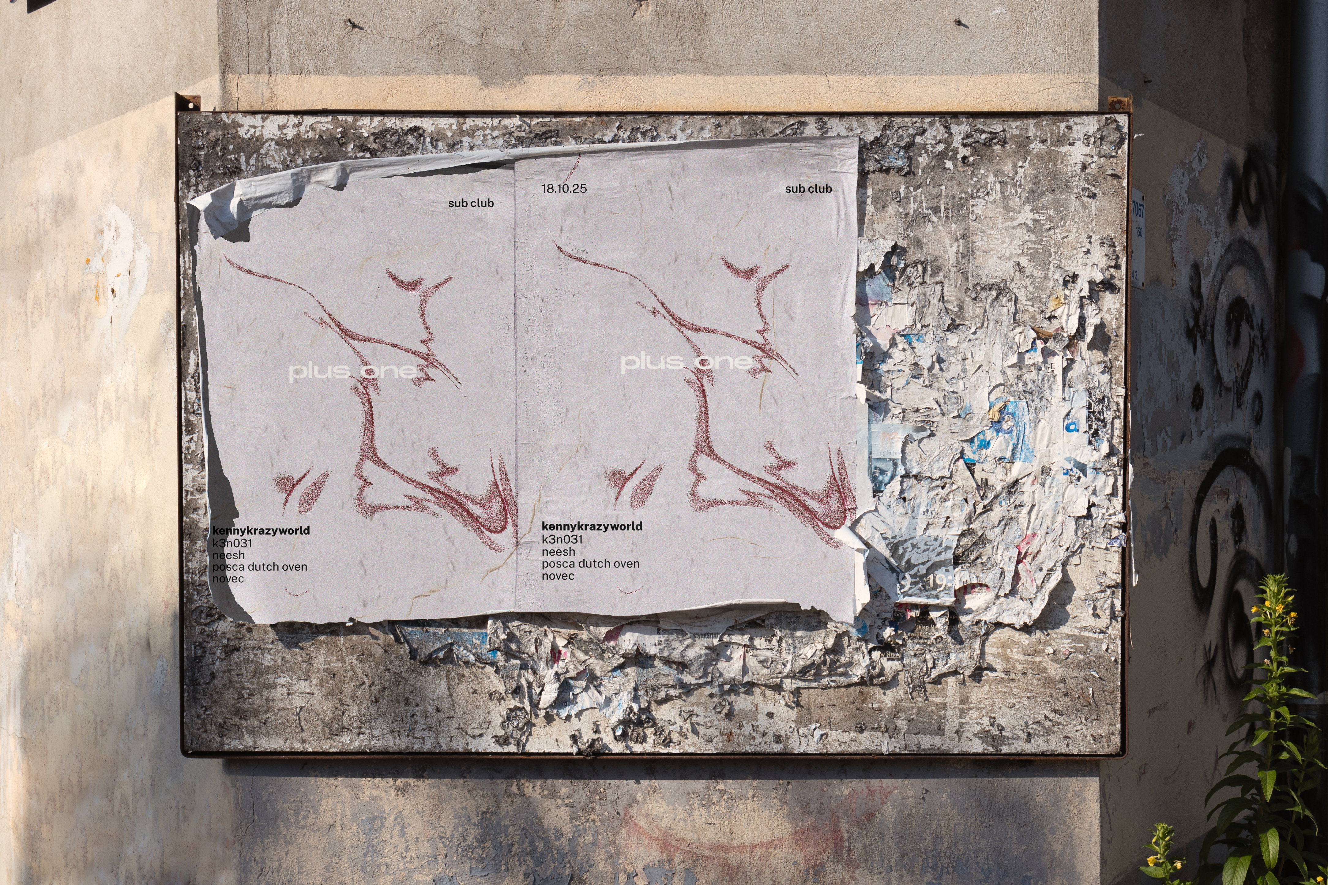
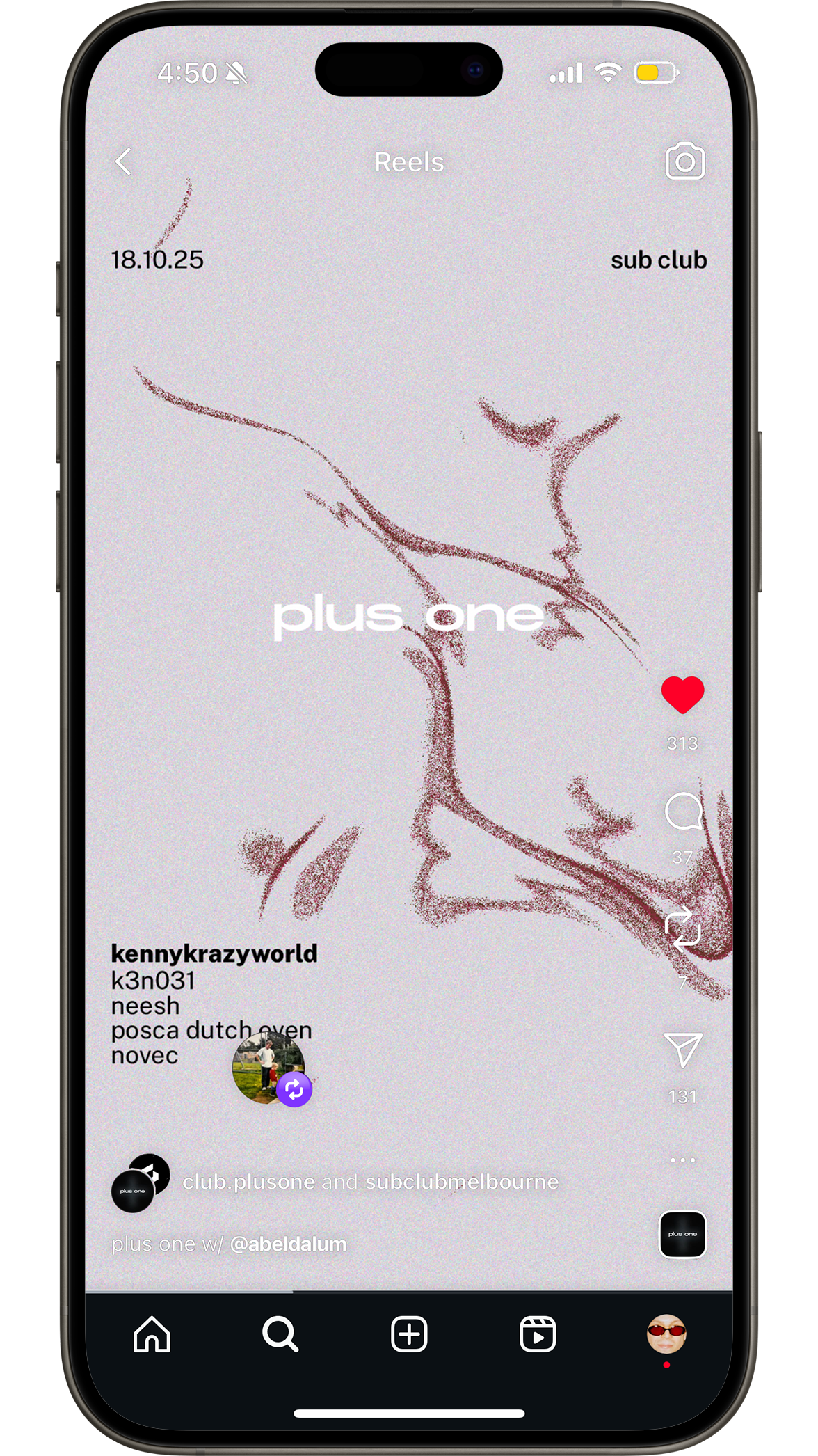
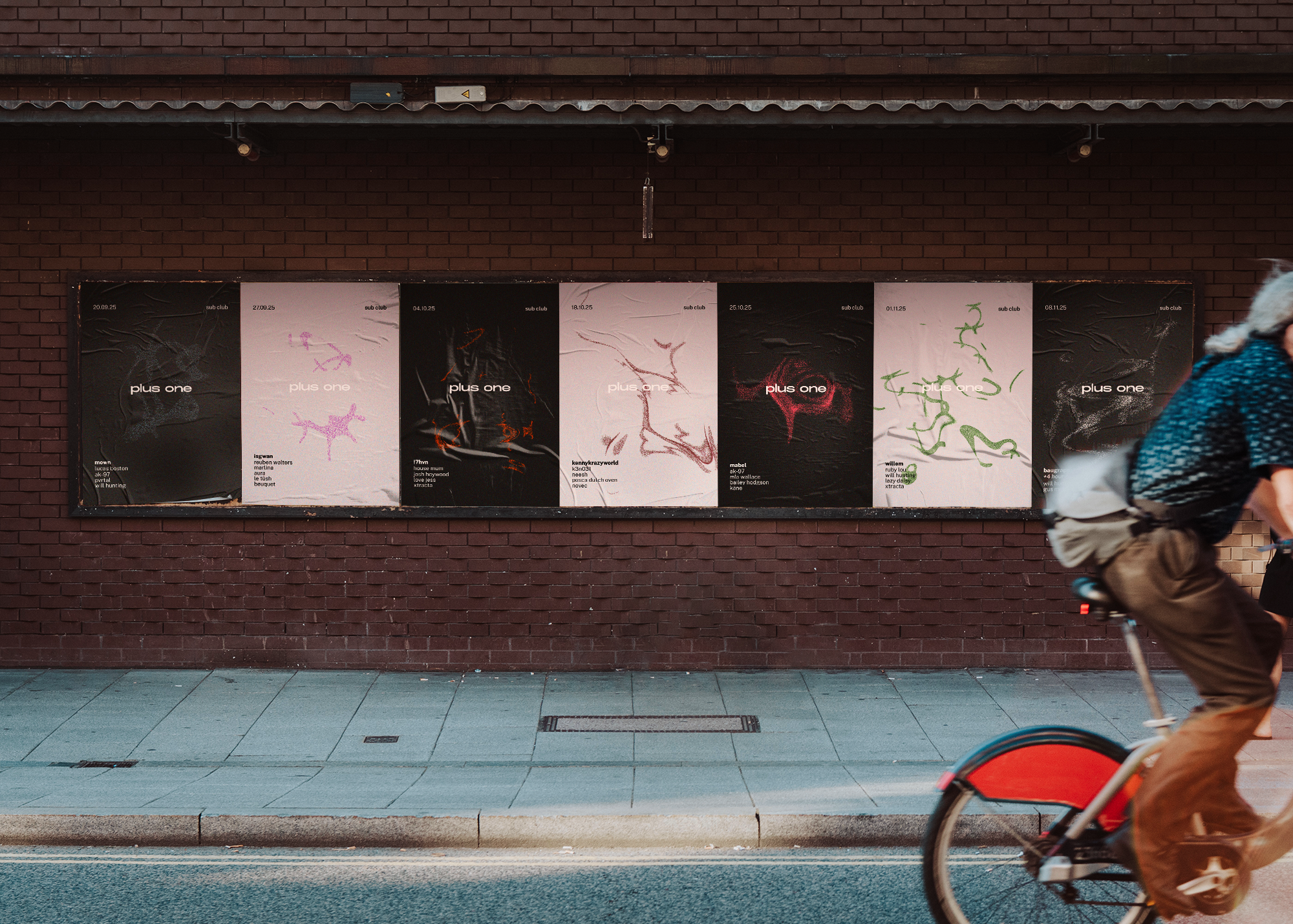
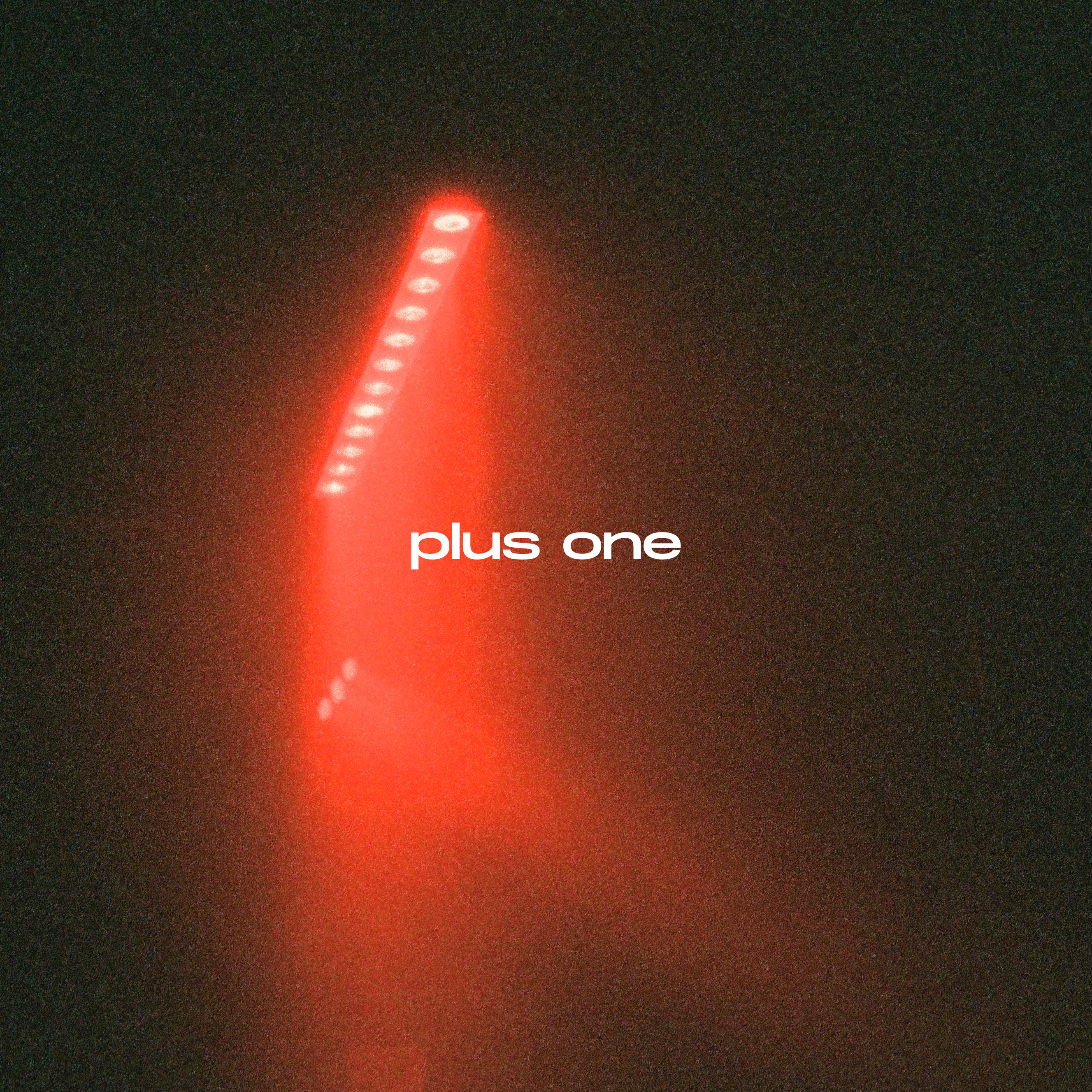
The result is a minimal system built around a wide wordmark and a dispersed grain that forms a quiet plus shape. It’s soft, atmospheric and simple, but still textured enough to feel alive. The grain becomes a recurring visual language across the identity, giving a sense of movement and depth without drawing to much attention.
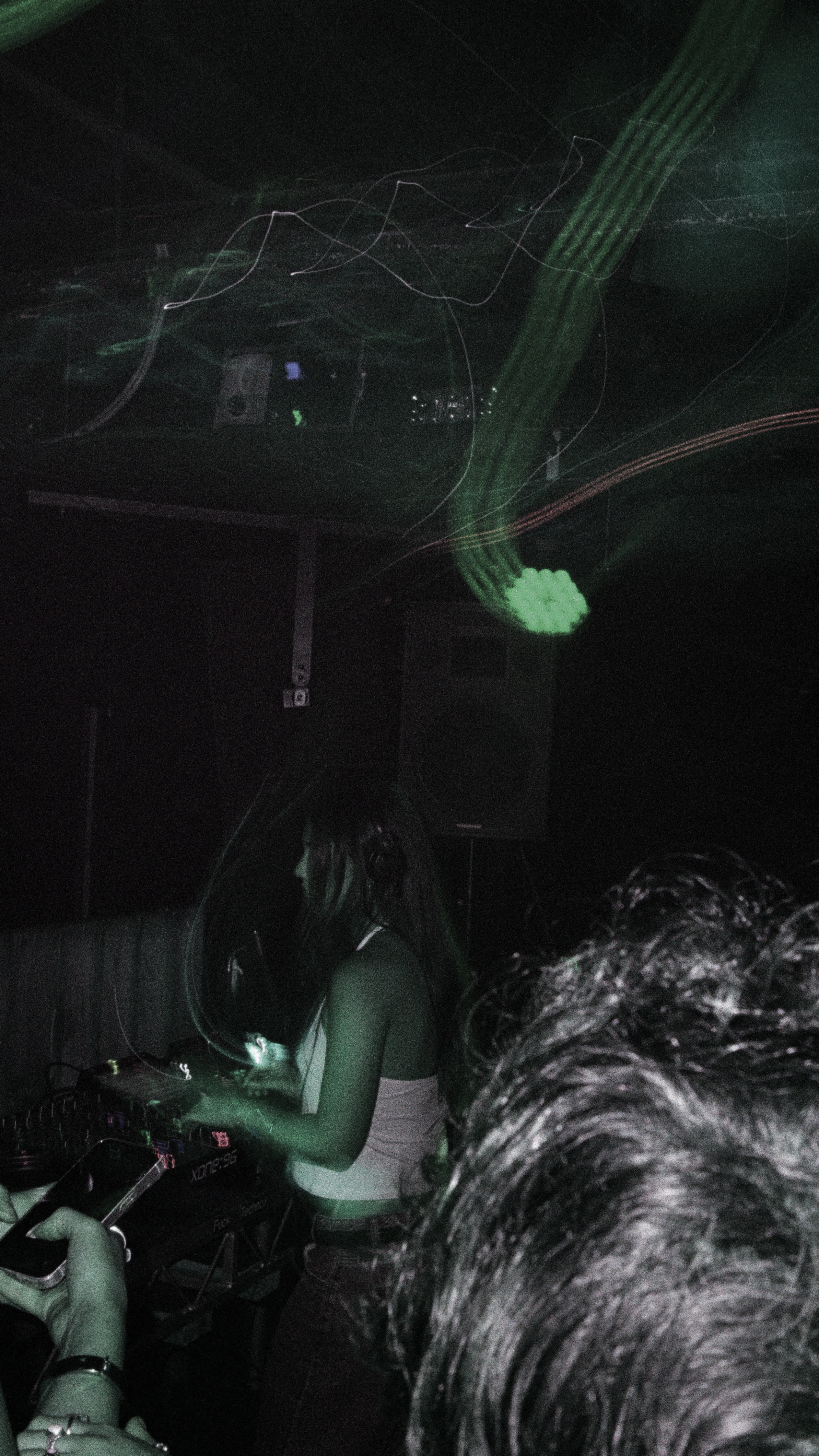
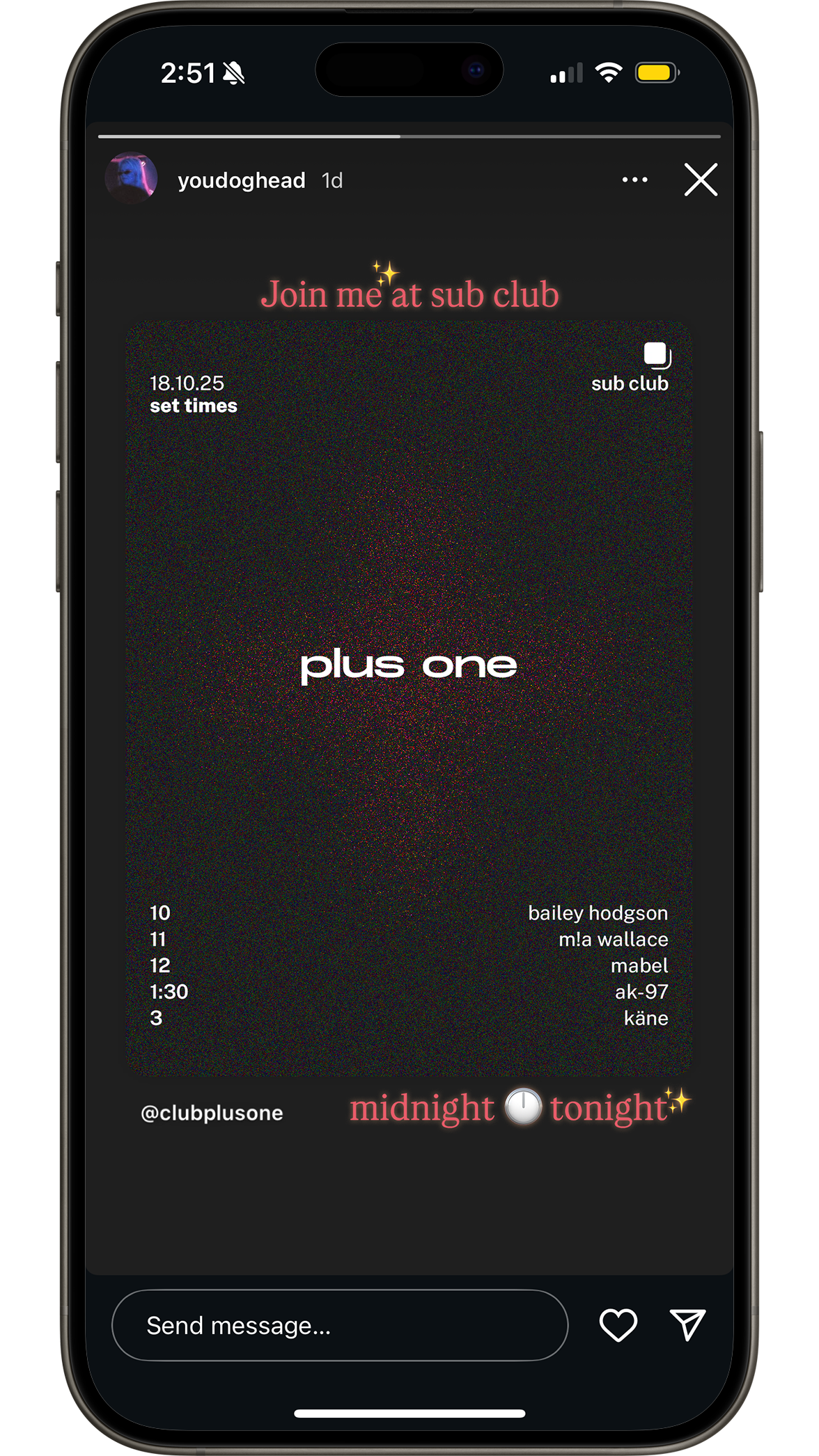
Each week uses the same structure but changes in colour and tone. Backgrounds alternate between ivory and charcoal, and each edition introduces a new accent colour and motion graphic. In motion, the grains drift and fade in sync to music produced by the headlining artist for that week.
The layout is strict but quiet. Dates, venues and lineups are placed with restraint, using simple sans-serif type and consistent spacing to keep everything balanced. The identity feels like it belongs in the club scene but doesn’t rely on trend. It’s understated on purpose.
plus one doesn’t shout to get attention. It already has it.
My role covered the full visual direction of the project. I worked closely with the client to build the identity from scratch. Colour, typography, layout and motion design included. The brief asked for no hard edges, no defined shapes, medium to low contrast. The brand name needed to sit front and centre and the main focus was on subtlety, space and confidence.
The result is a minimal system built around a wide wordmark and a dispersed grain that forms a quiet plus shape. It’s soft, atmospheric and simple, but still textured enough to feel alive. The grain becomes a recurring visual language across the identity, giving a sense of movement and depth without drawing to much attention.
Each week uses the same structure but changes in colour and tone. Backgrounds alternate between ivory and charcoal, and each edition introduces a new accent colour and motion graphic. In motion, the grains drift and fade in sync to music produced by the headlining artist for that week.
The layout is strict but quiet. Dates, venues and lineups are placed with restraint, using simple sans-serif type and consistent spacing to keep everything balanced. The identity feels like it belongs in the club scene but doesn’t rely on trend. It’s understated on purpose.
plus one doesn’t shout to get attention. It already has it.